- Home
- Bruce McCall
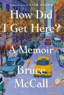
How Did I Get Here? Page 8
How Did I Get Here? Read online
Page 8
Dad suggested I contact Rudy Suzana, who ran WAA. I slapped a portfolio together, raced downtown to the modest-size studio in a modest two-story building at the modest intersection of Pelissier Street and University Avenue. A dark, unmanned reception area finally disgorged the studio co-owner, senior illustrator, and boss. Rudy was swarthy, taciturn, and solemn. He didn’t exactly invite intimacy; in fact, our relationship was no warmer on my last day in the studio than on my first. This was a major reason why the studio atmosphere never got relaxed or chummy.
Rudy’s scan of my portfolio was cursory. I don’t think he gave much of a damn about my talent or potential. He needed an apprentice who would earn his keep by running errands and performing humble tasks. One day, if I was diligent and patient, I would ascend to the brotherhood of commercial automobile artists. I was hired, for $39 a week.
I unreservedly admired Rudy’s illustrative skill. He robotically generated immaculate painting after painting, neatly avoiding the flashy and the ordinary. He found, or devised, ways to caress the eye and excite the imagination: an extra tone of gold on a yellow car that would otherwise look gaudy. My deepest insight about Rudy came much later, and it explained why he mastered the craft, and the secret of success, for both commercial art studios and commercial illustrators. And why I could never succeed in the field. Rudy practiced art without being an artist. His was the perfect example of that approach. No other art form interested him. The richest artistic rewards—pride, satisfaction, a sense of achievement, the joy of creativity—were of zero interest to him. He didn’t have to set aside his artistic nature because he didn’t have one. Rudy was distanced from any emotional connection with his work, which liberated him from anxiety, second-guessing, and self-doubt. I envied this bastard relative of mental discipline, but not enough to emulate it.
That first month as part of the workforce propelled me into a whole new life. Learning a trade and finding my footing stimulated my senses. I’d expanded my understanding of the workings of the adult world. I busied myself assembling the tools every commercial artist needed. Little jars of gouache paint, differentiated from watercolor by its opacity. Sable brushes, expensive but necessary professional equipment that kept a point, didn’t get as stiff as a broom after a few uses, and wore out slowly. Pencils. Erasers. Metal rulers. French curves. And an airbrush, the indispensable secret of rendering smooth, slippery automobiles.
Airbrushes were expensive. I made do with various hand-me-downs. I never met an airbrush I didn’t loathe. That diabolical steel tube sucked its air supply from a hose that was connected to a compressor. The airbrush could spray large areas, such as the body of the car, or details—the highlighted curve of windshield glass or the tiny, sparkling sunbursts of highlights on chrome trim. The premixed body color was fed into the airbrush via a thimble-size metal cup on the side. Inside the tube, a fine steel needle sprayed a mixture of paint and air onto the illustration board where the drawing of the car awaited. In skilled hands the airbrush created a delicious illusion of paint so slick, so liquid-smooth, that fish could swim in it. In my hands the paint–water mix never worked. Either too much paint clogged the needle like mud, turning the intended light spray into a hiccup of spurts and blots, or too little paint and too much air created a pale, watery slick. My airbrush learning curve was a straight horizontal line. In the hours I spent disassembling that diabolical contraption—reaming out the tube and scraping incrustations of paint off the needle, trying hundreds of mixtures and failing to make the magic happen—I could have learned Urdu and Tagalog. Or graduated summa cum laude from the local taxidermy academy. Instead I sat there cursing the stupid, recalcitrant piece of shit.
I had felt out of place in this world at the outset, and that sense of apartness never changed. Most commercial artists I knew had brains and lively minds but were disinclined to exercise them. I don’t think my fellow artists had ever read a book for pleasure. Books and reading had been baked into me early, growing into a habit and dictating a value system. I was no intellectual, but my natural interests skewed toward the life of the mind. Braggadocio wasn’t justified—not by my embarrassing academic underperformance, capped by dropping out of high school. I stood awkwardly somewhere on the scale between very smart and very stupid. Which one was dependent on my environment of the moment. Reading was a big part of who I was. Without a constant intake, I’d starve. I never bonded with my studio workmates, but that was on me, not them, and I was too insecure to draw invidious comparisons. I simply aspired to ideas beyond “Hey, look at the tits on that one!” and “How’s about those fuckin’ Tigers, huh?”
Fantasy played a hefty role in my youthful thinking. It’s no surprise that I had naively hoped Windsor Advertising Artists would be not only a workplace but also a refuge from the ongoing domestic psychodrama of the McCall household. I soon saw exposed an internecine strife that was a miniature version of what I had at home. Rudy’s partner, Wilf Chauvin, was the gregarious client-contact man and handled the business side—most of the time from the cocktail lounge of the Norton Palmer Hotel down the block. The easygoing, soft-spoken, and reliably-plastered-by-dinnertime Wilf and no-nonsense Rudy were a match made in Bedlam. Meanwhile, the garishly talented, hotheaded second illustrator, Dick Miller, felt unappreciated and underpaid, and was both. Dick had been blessed with next-to-genius-level creative instincts, possibly a divine gift to offset a Snopesian upbringing on the wronger side of the wrong side of the tracks.
My instincts were creative: false starts, repeated failures, a messy way of working, all necessary parts of a process of discovery, the route to originality. Commercial art had no place for that process. Reliance on creative inspiration and its uncertainties was dangerous. In order to expend as little time as possible on a job, and thus to earn a profit and meet unyielding client deadlines, Rudy understood that painting almost anything—if properly approached—could be reduced from an ostensibly creative act to a series of specific steps. Without any grand plan, without conscious effort, he turned painting a car for advertising into a strict formula that made sound business sense. Rudy’s rules were his personal code. He never called it a formula, but a formula it was. He figured out how to save time: a basic tenet was Avoid creative innovation. Having no other point of reference, total ignorance of this mysterious craft, and all of two weeks’ commercial art experience, I naively embraced the formula, blissfully unaware that it was switching me onto a track that took me ever farther away from where my brains and proclivities wanted to go.
It wasn’t a conscious rebellion against the prevailing Stalinist orthodoxy so much as a burst of my natural whimsy when, a couple of months in, I painted, obediently formulaic in every detail, a Studebaker Champion—except for its rectangular wheels and tires. Then, a follow-up jape: the sacred Rolls-Royce radiator shell fronting a Buick Roadmaster. Rudy happened by, spotted these idiocies on my drawing board, and withdrew without a laugh, smile, or even a comment. I’ve since reflected on that incident. I believe it cooked my goose with Rudy, there and then: smart-ass kid, his reverence for the mission of glorifying Dodge Royal Lancers and DeSoto Firedomes dubious, his open playfulness an ill omen, his future as a Car Man unpromising.
A few years ago I acquired a 1954 Buick sales brochure, my personal Rosebud, to deliberately induce a nostalgie de la boue reverie. Leafing through its pages brought on that wallowing masochism even more intensely than I’d expected. In my second week of apprenticeship, there being no school to teach and test my skills, I had followed Rudy’s dictum: learn how to become an automobile illustrator by copying other car ads. After copying enough of them, I’d have absorbed gut truths. I’d meet tough standards. I’d eventually compound lessons from all my efforts to create my very own style. I chose a Buick brochure that featured every 1954 model. It looked so simple at first: duplicate that printed Buick. Trace the illustration line for line, with excruciating care. First, paint the tires and wheel wells lampblack, to establish contrast. Mix the
perfect color match of the body and roof. Begin airbrushing the body, working light to dark. Paint in illusions of depth, reflections, and bright sunlight on the body. Then dote on every grille bar and door handle and glistening highlight. Capture the look and the feeling of power, the smoothness of those flanks. I captured zilch. Late in the day, I carried two or three Buick renderings to the garbage can.
That brochure, I later conjectured, must have been an early example—perhaps the first—illustrated by Fitz and Van, the brand name of Art Fitzpatrick and Van Kaufman, who would polish their craft and reign over the automobile illustration culture of the sixties with their impossibly flash Pontiac ads. Their Catalinas and Bonnevilles set the realism of dimensions aside. They resembled aircraft carriers on wheels. A Pontiac was described as “Wide-Track” in ad copy, which granted license to stretch the car’s width to parodic extremes. Fitz and Van’s Pontiacs didn’t belong in the real world. Neither did their settings: ritzy European city squares, fantasy Mediterranean yacht clubs, big-shot conferences in some Potemkin village in France. The final touch consisted of the people admiring the Pontiac (always parked just so). Grace Kelly’s double at the wheel. A brigade of George Hamiltons in tennis whites or golfing outfits, cracking clean jokes: Pontiacs weren’t driven by yahoos.
My attempts to hang out in Fitz and Van Land fell short. An HB pencil fuzzed lines and ensured grille bars that were mangled and of various sizes. Oval tires here, rhomboidal tires there. The airbrush I wielded spat uneven blurts of color. Dote as I might, the juicy details required of an authentic Buick read as crooked, misshapen, dulled-down experiments. I hid my hideous renderings from prying—i.e., professional—eyes.
If I could have afforded to be honest with myself, the saga of the Buick brochure would have suggested that I try some other line of endeavor, move on to something—anything—less fraught. I was afraid to admit defeat. Also, in a postadolescent fever dream, I had drunk the Kool-Aid: my fluky advent at Windsor Advertising Artists—an ogre of a father tossing off a clue that led to a job in an art studio that same day—was the work of kismet, and you don’t cross kismet. So, I felt, there I should remain. My decision was sealed by the belief that I was a wretch, fit for no other job, anywhere. So bear down harder, I counseled myself. You were ordained by fate to be a commercial artist. Where was it written that work in the adult world was supposed to be fun?
I consigned my instincts to a mental steamer trunk, buried it deep in my psyche under a pile of other failures, and halfheartedly persevered. Sealing my fate was the absence of a mentor, a critic, a relative, or a friend—anyone aware of my potential and honest or simply concerned enough to blow the whistle. Rudy seldom stopped by to evaluate my progress (and frankly, avoiding that downbeat critic was a strategy on my part). Rudy wouldn’t care about my agonies. I was the messenger/errand boy/studio dogsbody. That job description fit his needs.
Meanwhile, Dick had finally made good on his threats and bolted across the border to hit the jackpot in a big Detroit studio. His replacement was Bill Windsor, as earnest and sweet-natured as Dick was rambunctious. Bill had labored at the semi-medieval practice of hand-lettering Johnnie Walker and Canadian Club labels. He had never drawn or painted a car, but six months and a stomach ulcer later, he was ready. Rudy then hired Louie, an amiable dolt of about my age. Within the year he was churning out professional-grade illustrations. I added another humiliation to my résumé. Louie soon left Windsor and its Advertising Artists for greener pastures. What did that amiable dolt have that I lacked? Good question!
The two people who might have offered advice—Rudy and my father—had no advice, no comment: Rudy because at $39 a week he could afford a dogsbody and couldn’t care less whether I ever made the grade; my father because he seemed incurious about my personal crises. His sole concern was that I never shame myself or him with joblessness, which was a crime, a curse, worse than mere professional failure. His absolutism helped keep me shackled to the drawing board, trying to ignore the acrid taste of bile inching up my throat and lodging in my craw.
* * *
■ ■ ■
Creating a new piece of artwork began across the river at the ad agency. A sketch artist drew a tight rendering of every ad or brochure page—the model and color of the car, the angle of its positioning in one idealized situation or another, the even more idealized people inside the car beaming out at the world or standing nearby, beaming in. No single illustrator was deemed versatile enough to paint an entire ad. The final art combined the individual skills of a car man, a background man, and a figure man. Their various contributions were cut out and glued in place on the car illustration, forming a single image.
Talent wasn’t necessary to slice up a black-and-white photo of the car featured in the illustration, but nerve was. Stretching its length, width, and ground clearance demanded brutal surgery. It required keen judgment to decide where the eye could accept cheating and where rampant distortion was revealed. The camera doesn’t lie, but those freakishly elongated, low-riding beasts were whoppers beyond the capacity of the widest wide-angle lens. It would eventually confound me that the Chrysler engineers who vetted every illustration—checking for the correct number of horizontal grille bars, pointing out deviations in intricate upholstery patterns—never quibbled with the grotesque deformations of the car.
The original photo of the car was cut into pieces, distorting its actual length, width, and height off the road with extra spacing, and then this assemblage was scotch-taped into an image bearing a passing resemblance to the photo. This was placed on a primitive magnifying device, the Lacey Lucy, cranked up to an image twice or three times its size, and traced on a transparent sheet of paper on a big glass screen. This was the master drawing, set down on a clean sheet of illustration board. The aim was near-blueprint clarity. A surgical exactitude obtained; the artist who rendered it was flying blind. He had to trust the accuracy of that drawing.
This marked the semifinal step before painting. A sheet of condom-thin, transparent frisket film was laid over the drawing. One side was slathered with a mixture of rubber cement and benzine thinner that quickly dried into a sticky glaze. The sheet was turned sticky-side down and smoothed over the drawing. (No bubbles or wrinkles could mar the glassy surface; if they did, someone—inevitably me—would be charged with tearing away the defective sheet and starting all over again.) A scalpel-sharp X-Acto blade was used to cut out and strip away all areas of the car’s body to be airbrushed. The frisket paper masked the grille and all non-body-color parts until airbrushing was finished. The frisket paper was then lifted off and painting could begin.
There were stringent rules about the color spectrum. For example, the artist wasted no time deciding how to render chromed bumpers, grilles, or wheel covers.
For skyward-facing chrome it had to be cerulean blue. Earth-facing chrome—bumper undersides and concave hubcap areas—reflected the road in yellow ochre. The horizon line separating the sky and road was always a thin line of lampblack. Wheel wells and tires were also black and were painted early to establish maximum contrast with the raw white of everything else.
The face of every car was its grille, conveying power and authority and a fifties idea of costly elegance. This often meant bullet-shaped bumper guards big enough to bunt a locomotive into the weeds, tucked under a gaping, chrome-framed mouth stuffed with horizontal bars, patterned mesh, fake heraldry, and other fancies, all sufficient to frighten Liberace.
* * *
■ ■ ■
Windsor was where I learned to smoke, drive a car, and unhook a brassiere. It amazes me today to realize that these feats all occurred outside the studio. The studio devoured my time to an extent normally experienced only by lifers in San Quentin. Half of every weekend was often spent, or misspent, in the studio. Then came catalog season, a siege of nonstop labor stretching from early June through mid-September. It was assumed that my weekends belonged to the studio. Of the sixty-six weeke
nds over six summers at Windsor Advertising Artists, I managed to be elsewhere only six or seven Saturdays and Sundays.
The workload was crushing: page after page after page of illustrations, principally cars but also virtually every detail of every model. From instrument panels, to close-ups of push-button automatic transmissions, to rear-seat views, to open trunks, to V-8 engines, to Milady’s dainty gloved hand twirling the power-assisted steering wheel and her shoe tapping the brake pedal, it amounted to far more work than the studio could handle. Rudy brought in seasoned Detroit freelancers to manage the overflow. He was even forced to use me. I painted Milady’s shoe gently pressing on a brake pedal. Next I rendered the face panel of the PowerFlite automatic push-button transmission.
I wasn’t trusted to depict all-new Highway Hi-Fi, a 45 rpm extra-cost option to be trundled out of the glove box to play musical numbers—very briefly, given the inability of the 45 rpm player to play for longer than ninety-six seconds. Alas, bumpy roads and smooth music couldn’t coexist. A year later, Highway Hi-Fi no longer existed. Likewise what we called the swing-away seat, swiveling outward on the front passenger side for graceful exits. That extra-cost option exited before the next model year. The push-button transmission was a novelty for novelty’s sake, a superficial innovation meant to help differentiate Chrysler from its better-selling GM and Ford competitors. Pushing buttons contributed zilch to gear-shifting efficiency and captured zero praise and feeble attention. Chrysler Corporation’s product planners were twenty years late with the drama of the push-button concept: by the mid-fifties it was as all-new as a 1937 Buck Rogers comic book.
 How Did I Get Here?
 50 Things to Do With a Book